
The Colorist and Crayola Crayons

“Artists are just children who refuse to put down their crayons.” Al Hirschfeld
Only 3 years old, I have fond memories of my mother bringing a fresh box of 48 Crayola Crayons home to our barracks in the Aleutian Islands -Adak, Alaska. Little did I know that it was such an influence in my creative life? I would analyze each color, the milky color of apricot, complimenting the silvery periwinkle and perfect combination with magenta. The combinations were endless and I was determined to explore as many as I could create.
I do remember my first coloring, a pig, with the famous Carnation Pink. I don’t think I cared about the pig as much as seeing the beauty of the luscious pink. Is this my imagination? Could a three year old have experienced such intensity?
My first day in Kindergarten I was handed a box of 8 crayons. My first thought was “where is my box of 48? How could I possibly create anything with these primary colors?” I remember asking my teacher if I could bring my own crayons. “Of course, Janet if you can bring them for the entire class to share”. Well that ended that. I had to learn new ways to compensate, outlining in black, which soon changed because the teacher thought I was depressed. Then I would outline the inside of the object and color it different colors or layer colors.
Today I relate to the crayon colors similarities to my oil paints, bittersweet becomes Quinacridone Burnt Sienna combined with white, midnight blue now the famous Prussian Blue, Brick red similar to Indian Red and Magenta close to Permanent Rose.
Crayola Crayons simply prepared my sensibility to color. Could it even of affected me at a neurological level, as described in the book, "The Talent Code" by Daniel Coyle?
Color is my first love and as I have always said, "Without color I wouldn't paint".
*ART20K footage completed 5268 square inches.
*Painting above, Title: "A View From The 18th Hole", measures 36″ x 48", Oil on museum wrapped canvas (no need for framing), Price $4320
*All art from Janet Vanderhoof’s Fine Art Gallery, maybe seen in Janet’s studio at Morgan Hill, CA. You may purchase through contacting my email jvander51@msn.com or phone (408) 460-7237. Thank you!
Three Colors and a Pusher

"Working with a limited palette of elements leaves a designer nowhere to hide." ~Michael Bierut
Could this be the same for the Art World?
Ken Auster says, “When using a limited palette you solve most of your problems. You can’t mix the wrong color, although you may put it in the wrong place.”
Preferring my many colors to choose from, including Quinacridone Magenta, Green Gold, Quinacridone Burnt Orange, et cetera, et cetera, it was quite a discipline to paint the above painting with only three colors, Alizarin Crimson, Ultramarine Blue, and Cadmium Yellow Light. Also, added were Ivory Black, Titanium White and the pusher color Cadmium Red.
Ken Auster was correct in saying that you can’t make a bad color when mixing these colors together. Even though mud is made, focusing on edges and correct placement, the palette will be in perfect harmony.
A beginner would do well to paint with a limited pallet, especially when you add composition, stroke and value into the mix. Notice no neutrals are used, except the grey from black and white. Using neutrals when beginning isn't necessary, since most of the time a beginner will make plenty of them on their own. Avoiding neutrals will limit the chance of the painting turning into complete mud.
Almost every color can be made with the three above colors, except Cadmium Red. Cadmium Red cannot be made. I used Cadmium Red for the pusher color. Since it is a bright it is a great color to be used for the focal point.
Another wonderful palette you can try is; Indian Yellow (preferably Daniel Smith’s brand), Permanent Rose and Thalo Turquoise, plus black and white. The pusher color could then be Mediterranean Blue. This palette is great for a cooler painting. Ivory Black and Titanium White are added to create the neutrals. They make the most wonderful opalescent colors.
Do you have a favorite limited palette you would like to share?
This is my forty-first painting of my #paint52 challenge, medium Oil on vellum, measures 14" x 20″ price $795.00 plus Shipping and Handling.
*All art from Janet Vanderhoof’s Fine Art Gallery, maybe seen in Janet’s studio at Morgan Hill, CA. You may purchase through contacting my email jvander51@msn.com or phone (408) 460-7237. Thank you!

Twitter Followers #paint52

I was enticed to paint this painting reflecting the common people, people in our everyday life, such a variety, all unique and distinct. But there was also something "sheepish" about how they were marching all in a row, making sure they kept their appropriate space from the person in front or behind. Some seemed conscious, while others were definitely not present. They almost seemed to be marching, and marching, where? Where are they going? Are we caught following others, sometimes forgetting our own journey or perhaps following others dreams not our own? Or just caught in our daily life routines, one day the same as the next, just out of habit. Can we wake up and enjoy our surroundings?
This is painting thirteen of my #paint52 Challenge and another painting for my San Francisco series. "Twitter Followers" measures 24" X 48", oil on linen.
Thanks again for all your support following my challenge and especially when you leave a comment. I so appreciate it.

Do You Dare?

Have ever wondered where your painting was going? I have put myself in such an odd situation with this painting and a lot of firsts. So many that I didn’t know where or what was going to happen next. First of all, painting a red under-painting, with green being the dominat color, created a very narrow bridge for me to walk on. That’s what happens when you take risks. I guess a risk is a risk when you don’t know what is going to happen. Trusting or maybe best of all having no attachment to the outcome is a better choice. This gives me the freedom to not have it turn out or be “right”. My process in this painting is one stroke at a time and the relationship to the last stroke or it’s surroundings. I believe I will reach a point where I won’t be lead but will lead, but right now I have to follow. As my son Blake would say at the end of every movie “to be continued”.

California Here I Come #paint52

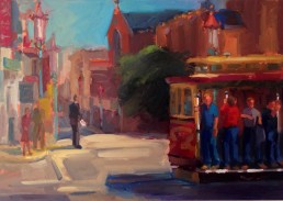
When I was nine, I had to move to France after my father died. Not only did I lose my father, but I had to leave my home, my friends and my country. My mother was French and wanted to go back home to her family, but I was brought up in the U.S., and wanted to stay in my beloved country. My mother had a change of heart and returned back to the U.S. five months later. I remember singing to myself on the flight home, "California Here I Come". For some reason this painting reminded me of this, the man in the orange shirt looking like he came from another state for sure and the various ethnic people, combines to make what San Francisco and our country is all about, a melting pot of the world. By the way the location of this painting is California Street.
The painting has an ultramarine blue underpainting. I knew right off the bat this was going to create some difficulties, yet I didn't know how hard it was going to be until I got started. I am determined to push myself in this challenge and try things I never have done before. Most artists would say that the man's orange shirt is too bright and would dominate the painting, but that was the reason why I painted this painting. How bright could I make his shirt and still have the viewers eye move around the canvas. I also wanted it to vibrate in color. which I do believe it does. At first I thought I would start laying in the painting without a drawing, but it was too big and too much going on. Since the color was so dark, I had to use chalk; see image below.

I am finding that I am allowing my "Making Faces" characters come to life in my paintings. I am throughly enjoying this and loving the little stories that each one bring. I have been so fortunate to have had great training on the body, for 4 years from George De Groat my teacher in my early years as an artist. He was a genius. This is my tenth painting of my #paint52 challenge, painted in oil, measures 24" X 48" and another addition to my San Francisco series.
Thank you so much again, for supporting me in this challenge it means the world to me.