
Do You See What I See?

My color theory teacher and I were both looking out the window gazing at the tree limbs? It was the first time that I experienced the idea of Color Seeing, which was originally introduced by Hawthorne at the “Cape Cod School of Art”. Hawthorne was a contemporary of Monet and took his color seeing a step further. As my teacher and I were both looking at the same tree, he discovered a bluish note, but I thought it was more reddish. He said he noticed that I tended to see colors much warmer then him.
Does each person see color differently? Could this be a result of acuity, age or even drugs? I heard that Van Gogh had lead poisoning, which caused him to see halos around objects, as well as the digitalis that he took for Epilepsy caused a yellow aura and yellow spots in his vision. Could this be a result of his “Yellow Period”?
Did Renoir’s myopic vision in his later years cause him to produce brighter colors, primarily reds and oranges, with thicker and sketchier strokes?
Monet’s cataracts caused yellowing and darkening of the lense of his eye, thus influenced his painting to be muddied and blurred. There was an interesting paper written by Michael F. Marmor, MD, Stanford University Medical Center, Department of Ophthalmology, “Ophthalmology and Art: Simulation of Monet’s Cataracts and Degas’ Retinal Disease", that gives you the visuals of what he suspects were the recreated vision of both these artists.
Food for thought, that we as artists are not only affected by style preference, and eye hand coordination, but extremely affected by our vision and how we see the world.
*This is my twenty-fifth painting of my paint 52 challenge, measures 30" X 30" Atelier Acrylic and Oil on Museum wrapped canvas (no need for framing), price $2250 SOLD. Thank you so much for following my journey.
It's All In The Details

Have you ever noticed a painting within a painting in your creations, or other artist’s creations? They can be quite inspiring. In fact, my teacher has taken many of his paintings that don’t work, and chops them up to find little masterpieces.

Many times my Internet viewers have told me my art shows so much better in person. One reason for this observation is everyone’s computer will experience different color; some are warmer, cooler brighter or duller, but another reason it is you perceive the painting as a whole not as its parts. It is difficult to see the fine nuances of texture, elevation, stroke and layers of color on the Internet.

If you find me in a gallery, you will see my face very close to the art. I love to become the fly on the wall, discover all the secrets, the genius of other artists. This can only be found by being very close as well as the unity discovered when standing afar.

The images above are details of my painting “Day of the Eucalyptus”. “Day of the Eucalyptus” is my twenty-fourth painting of my #paint52 challenge, measures 15” X 15”, Atelier Interactive Acrylic and oil on vellum, price $525.
Thank you again for taking the time to visit my blog and leave your wonderful comments.

WAKE UP!

I do my best thinking while on the treadmill, the repetitive walking, stomp, stomp, stomp forces me to connect to the “greater mind” and receive my best ideas. It brought me to a question, “why do I have a need to paint vivid color?
I heard a quote today from Iyanla Vanzant, “Our eyes adjust to the level of deficiency present.” As our vision is obscured, we become accustomed to our everyday way of thinking, preventing us from exploring outside our comfort zone.
And yet, could it be that there is a lot more that is going on around us daily that we are unable to see and don’t have the level of consciousness to understand?
While painting Plein Air, a person came over to me perturbed as if I made a terrible mistake, “I don’t see that color!” Of course his untrained eye only knew local color and was unable to see what was actually there.
Taking it a step further my painting goes beyond local color and hopefully like a strong cup of coffee, WAKES YOU UP!
This is my 22nd painting for my #paint52 Challenge, measures approx. 9-1/2 " x 9-1/2", Atelier Interactive Acrylic on vellum*. Price $190.00
*Vellum is archival, a heavy paper resembles the thickness of mat board.

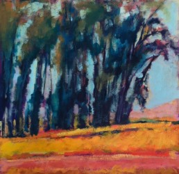
The Trees of Wisdom

The Tree’s Wisdom
Finding our power within
Learning from nature
A canopy of strength
Roots tamper the earths crust
Discovering the spirit of life
Calling our name
Calling our soul
Ending our strife
This is my 21st painting of my #paint52 challenge. The painting measures 24" X 36", medium Daniel Smith Oil and Atelier Interactive Acrylic on museum wrapped canvas. No need to frame. Price $2160 plus freight.
*My tree paintings are teaching me.

Third Eye Samurai

I have been going through much healing lately and one of the ways I have been doing this is to meditate on my chakras, by using the lovely chakra meditation “Running the Rainbow”, by Laura Alden Kamm. There are seven main centers of the body, each one a spiral of energy. Each chakra is represented by the colors of the spectrum. “Color therapy can be shown to help on a physical level; however there are deeper issues around the colors on the psychological and spiritual levels. Color has a profound effect on us on all levels, physical, mental, emotional and spiritual. If our energy centers become blocked or depleted, then our body cannot function properly and this, in turn, can lead to a variety of problems on any level.”
What I have noticed lately is the colors are showing up in my paintings, either what I need or a reflection of my healing of the chakras. It became pretty evident in my last painting, showing red, yellow and purple. Remember the base of the spine is represented by red, an indicator for a need of stability and survival, yellow governing self-esteem and wisdom, and purple relating to our higher self and higher consciousness. They also represent different organs in the body.
I am currently taking The Blog Triage class by Alyson Stanfield and Cynthia Morris. She was asking me the other day about my tag line: “Art in life and spirit in art” – “What does it mean to you?” I realized that my spirit shows in all my work and it is a reflection of my life at that particular moment that I painted the painting. As I live my life, my spirit is reflected in my art. Also speaking of spirits, the title of this piece is “Third Eye Samurai”. Do you also see the spirits of the Samurai in this painting? I didn’t realize they were there until I took the photo, yet my husband noticed them right away. But, that may be a whole other blog.
My intention is for you to discover healing when seeing my paintings, that the colors can also have a positive psychological and spiritual affect for each observer that owns one of my paintings.
This is the twentieth painting of my #paint52 challenge, Atelier Interactive Acrylics on a museum wrapped canvas, measuring 24” X 36”, price $2160. SOLD
As always I cherish your comments. Thank you!