
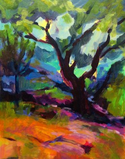
Third Eye Samurai

I have been going through much healing lately and one of the ways I have been doing this is to meditate on my chakras, by using the lovely chakra meditation “Running the Rainbow”, by Laura Alden Kamm. There are seven main centers of the body, each one a spiral of energy. Each chakra is represented by the colors of the spectrum. “Color therapy can be shown to help on a physical level; however there are deeper issues around the colors on the psychological and spiritual levels. Color has a profound effect on us on all levels, physical, mental, emotional and spiritual. If our energy centers become blocked or depleted, then our body cannot function properly and this, in turn, can lead to a variety of problems on any level.”
What I have noticed lately is the colors are showing up in my paintings, either what I need or a reflection of my healing of the chakras. It became pretty evident in my last painting, showing red, yellow and purple. Remember the base of the spine is represented by red, an indicator for a need of stability and survival, yellow governing self-esteem and wisdom, and purple relating to our higher self and higher consciousness. They also represent different organs in the body.
I am currently taking The Blog Triage class by Alyson Stanfield and Cynthia Morris. She was asking me the other day about my tag line: “Art in life and spirit in art” – “What does it mean to you?” I realized that my spirit shows in all my work and it is a reflection of my life at that particular moment that I painted the painting. As I live my life, my spirit is reflected in my art. Also speaking of spirits, the title of this piece is “Third Eye Samurai”. Do you also see the spirits of the Samurai in this painting? I didn’t realize they were there until I took the photo, yet my husband noticed them right away. But, that may be a whole other blog.
My intention is for you to discover healing when seeing my paintings, that the colors can also have a positive psychological and spiritual affect for each observer that owns one of my paintings.
This is the twentieth painting of my #paint52 challenge, Atelier Interactive Acrylics on a museum wrapped canvas, measuring 24” X 36”, price $2160. SOLD
As always I cherish your comments. Thank you!
My Drug of Choice #paint52

I knew I love color, but I just realized I’m and addict. I'm a color junkie. Color is my drug of choice. Honestly, I have been expressing how much I love color and that is what my paintings are about, but didn’t realize how much or the depth of truth in which I said it. Especially, now that I have been painting consecutively, due to my paint52 challenge, it has become more apparent.
In my early years of painting, in my teacher George de Groat’s class, I noticed a woman painting across from me, using a bright pink, pinker than any pink that I have experienced. I had to ask her where she got it. She mentioned it was permanent rose, by Shiva Signature Oils. I ended up purchasing it and found it to be intense and highly saturated and of course wonderful. It was the beginning of my drug habit.
Wolf Kahn said he has a person make his pastels. He wanted a special blue and what he told her was “I want a blue, bluer than any blue you have seen before”. He did get his wish. That’s what I want. I want to use and have color combinations that most people have never seen before. I want the viewer to be taken on a color trip.
Wolf Kahn~Color and Consequence
[vimeo]http://vimeo.com/25903931[/vimeo]
I have found in my search for colors that certain brands are better than others for certain colors. You can’t beat Daniel Smith for their Indian Yellow, Phthalo Turquoise and Quinacridone pigments. Do you have a favorite color? Does it have to be a particular brand?

You know it kind of reminds of that line from English Patient, when Almasy says “It is a very plum plum.” Color can take you to that place, that extra hyper sense of actually being able to taste, hear, smell, or feel its temperature. It can take you to another world, my hallucinatory world of Technicolor.

Who am I writing for?

With a commitment to building a more vibrant blog, I signed up for the 4-week Blog Triage class with Cynthia Morris and Alyson Stanfield. Today’s assignment is to describe the people I want to visit and read my blog.
This is difficult for me to pinpoint exactly who should read my blog, but I will say my intention is to bring you beauty, inspiration, education and innovation.
How will I do this?
Beauty: Through my creations whether it is my poetry or art, I hope to allow a space for respite and renewal.
Inspiration: Through my #paint52 Series, which takes you on a journey of my challenge to paint 52 paintings in one year, I hope to inspire you to create as well.
Innovation: Through alternative ways to create digitally and other mediums of exploration in art, become familiar with ways that can enhance your creations.
Education: By bringing to you art tips, history and literature regarding art.
my desire is to create dialogs with my friend’s fans and collectors.
In this fast moving world of left-brain activities, I hope to open your heart, stimulate your mind and feed your soul.

California Here I Come #paint52

When I was nine, I had to move to France after my father died. Not only did I lose my father, but I had to leave my home, my friends and my country. My mother was French and wanted to go back home to her family, but I was brought up in the U.S., and wanted to stay in my beloved country. My mother had a change of heart and returned back to the U.S. five months later. I remember singing to myself on the flight home, "California Here I Come". For some reason this painting reminded me of this, the man in the orange shirt looking like he came from another state for sure and the various ethnic people, combines to make what San Francisco and our country is all about, a melting pot of the world. By the way the location of this painting is California Street.
The painting has an ultramarine blue underpainting. I knew right off the bat this was going to create some difficulties, yet I didn't know how hard it was going to be until I got started. I am determined to push myself in this challenge and try things I never have done before. Most artists would say that the man's orange shirt is too bright and would dominate the painting, but that was the reason why I painted this painting. How bright could I make his shirt and still have the viewers eye move around the canvas. I also wanted it to vibrate in color. which I do believe it does. At first I thought I would start laying in the painting without a drawing, but it was too big and too much going on. Since the color was so dark, I had to use chalk; see image below.

I am finding that I am allowing my "Making Faces" characters come to life in my paintings. I am throughly enjoying this and loving the little stories that each one bring. I have been so fortunate to have had great training on the body, for 4 years from George De Groat my teacher in my early years as an artist. He was a genius. This is my tenth painting of my #paint52 challenge, painted in oil, measures 24" X 48" and another addition to my San Francisco series.
Thank you so much again, for supporting me in this challenge it means the world to me.

California Dreaming #Twitterartexhibit

This panting will be part of the Twitter Art Exhibit, initiated by artist David Sandum on Twitter. All entries must be no bigger than a postcard and will be displayed in the Moss Public Library in Norway. The proceeds will be donated to The Women's Crisis Center in Moss, for abused women and their children. The center also provides a 24 hour phone-service, counseling, food and shelter etc. The exhibit will provide much needed support for this charity and will subsidize lost funding that occurred this year. For more information please check out David's website http://davidsandumart.posterous.com/call-for-artists-2nd-twitter-art-exhibit-in-m