
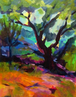
Third Eye Samurai

I have been going through much healing lately and one of the ways I have been doing this is to meditate on my chakras, by using the lovely chakra meditation “Running the Rainbow”, by Laura Alden Kamm. There are seven main centers of the body, each one a spiral of energy. Each chakra is represented by the colors of the spectrum. “Color therapy can be shown to help on a physical level; however there are deeper issues around the colors on the psychological and spiritual levels. Color has a profound effect on us on all levels, physical, mental, emotional and spiritual. If our energy centers become blocked or depleted, then our body cannot function properly and this, in turn, can lead to a variety of problems on any level.”
What I have noticed lately is the colors are showing up in my paintings, either what I need or a reflection of my healing of the chakras. It became pretty evident in my last painting, showing red, yellow and purple. Remember the base of the spine is represented by red, an indicator for a need of stability and survival, yellow governing self-esteem and wisdom, and purple relating to our higher self and higher consciousness. They also represent different organs in the body.
I am currently taking The Blog Triage class by Alyson Stanfield and Cynthia Morris. She was asking me the other day about my tag line: “Art in life and spirit in art” – “What does it mean to you?” I realized that my spirit shows in all my work and it is a reflection of my life at that particular moment that I painted the painting. As I live my life, my spirit is reflected in my art. Also speaking of spirits, the title of this piece is “Third Eye Samurai”. Do you also see the spirits of the Samurai in this painting? I didn’t realize they were there until I took the photo, yet my husband noticed them right away. But, that may be a whole other blog.
My intention is for you to discover healing when seeing my paintings, that the colors can also have a positive psychological and spiritual affect for each observer that owns one of my paintings.
This is the twentieth painting of my #paint52 challenge, Atelier Interactive Acrylics on a museum wrapped canvas, measuring 24” X 36”, price $2160. SOLD
As always I cherish your comments. Thank you!
My Drug of Choice #paint52

I knew I love color, but I just realized I’m and addict. I'm a color junkie. Color is my drug of choice. Honestly, I have been expressing how much I love color and that is what my paintings are about, but didn’t realize how much or the depth of truth in which I said it. Especially, now that I have been painting consecutively, due to my paint52 challenge, it has become more apparent.
In my early years of painting, in my teacher George de Groat’s class, I noticed a woman painting across from me, using a bright pink, pinker than any pink that I have experienced. I had to ask her where she got it. She mentioned it was permanent rose, by Shiva Signature Oils. I ended up purchasing it and found it to be intense and highly saturated and of course wonderful. It was the beginning of my drug habit.
Wolf Kahn said he has a person make his pastels. He wanted a special blue and what he told her was “I want a blue, bluer than any blue you have seen before”. He did get his wish. That’s what I want. I want to use and have color combinations that most people have never seen before. I want the viewer to be taken on a color trip.
Wolf Kahn~Color and Consequence
[vimeo]http://vimeo.com/25903931[/vimeo]
I have found in my search for colors that certain brands are better than others for certain colors. You can’t beat Daniel Smith for their Indian Yellow, Phthalo Turquoise and Quinacridone pigments. Do you have a favorite color? Does it have to be a particular brand?

You know it kind of reminds of that line from English Patient, when Almasy says “It is a very plum plum.” Color can take you to that place, that extra hyper sense of actually being able to taste, hear, smell, or feel its temperature. It can take you to another world, my hallucinatory world of Technicolor.

Lover's Leaf #paint52

I have the most beautiful Chinese Maple in front of my house. Early spring weather has brought it into full bloom already. It’s magnificent and as usual I attempted to see if I could express its beauty. Sometimes that’s the problem with painting nature. It’s almost impossible to make it as beautiful. In fact, my teacher once said; if you can’t improve it then don’t change it. Ha, that sounds like the judges talking to the contestants on American Idol. They always think they can make it better than the original creator. Yet, when I create landscape paintings, I just wish I could give you a piece of what I see, a morsel of God, the passion, the brilliance, the colors.
This is my 16th painting for my #paint52 challenge. The painting measures 24" X 36" Atelier Interactive acrylic on a museum wrapped canvas (Framing isn't needed). Available for purchase $2160. Thanks so much for visiting.

Twitter Followers #paint52

I was enticed to paint this painting reflecting the common people, people in our everyday life, such a variety, all unique and distinct. But there was also something "sheepish" about how they were marching all in a row, making sure they kept their appropriate space from the person in front or behind. Some seemed conscious, while others were definitely not present. They almost seemed to be marching, and marching, where? Where are they going? Are we caught following others, sometimes forgetting our own journey or perhaps following others dreams not our own? Or just caught in our daily life routines, one day the same as the next, just out of habit. Can we wake up and enjoy our surroundings?
This is painting thirteen of my #paint52 Challenge and another painting for my San Francisco series. "Twitter Followers" measures 24" X 48", oil on linen.
Thanks again for all your support following my challenge and especially when you leave a comment. I so appreciate it.

Underneath #paint52

I know you must be wondering, why the name "Underneath" and how does it relate to this painting? Well, color is my language. It speaks in layers, vibrancy, tones, subtleties and more. Color reflects my mood, passion, feelings and desires. It is limitless in regards to what color expresses for me. So as the many layers of color and the color selection and well as the movement in the painting, it tells me subliminaly what is going on "underneath" the surface. I also wonder if the colors I chose correlate to the chakras in my body. It tells me what energies I should notice, as well as a way I need to balance and release. Wassily Kandinsky elaborated on color in his book "Concerning the Spiritual in Art" He talked about how certain colors can represent certain instruments, as well as a reflection of our soul.
When I painted this painting yesterday, I felt such a need to lay down color, I know that it was necessary for my well-being and expression to pull what was underneath the layers of my body, mind and soul, and transform it. Color becomes the alchemy from my spirit to the physical world.
This is my twelfth painting of my #paint52 challenge to paint 52 paintings this year. The painting measures 6-3/4" X 10", Atelier Acrylic on velum and is also for sale for $150.00, contact me if you are interested. SOLD Your support has been wonderful and I am so grateful, thank you!